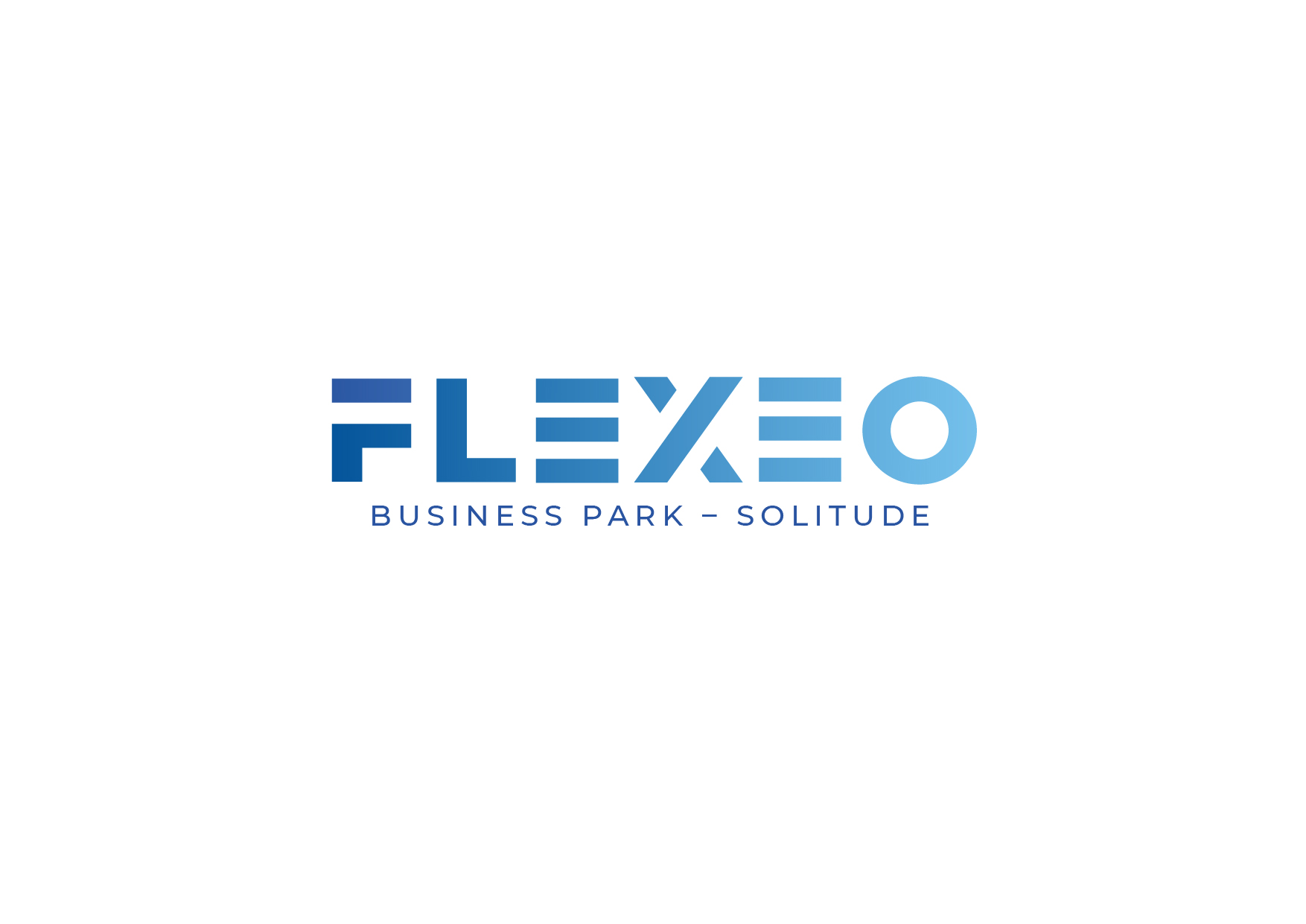
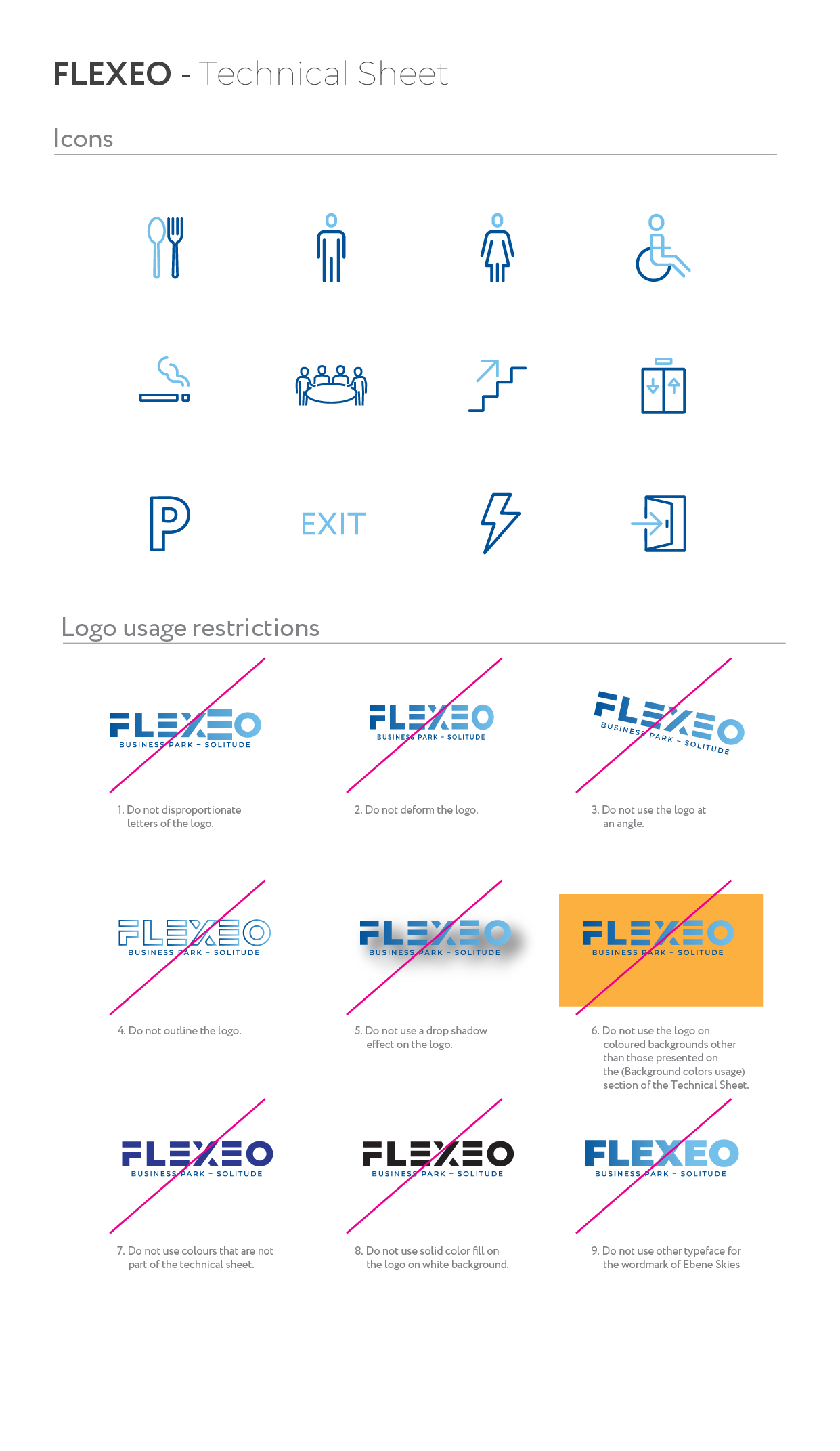
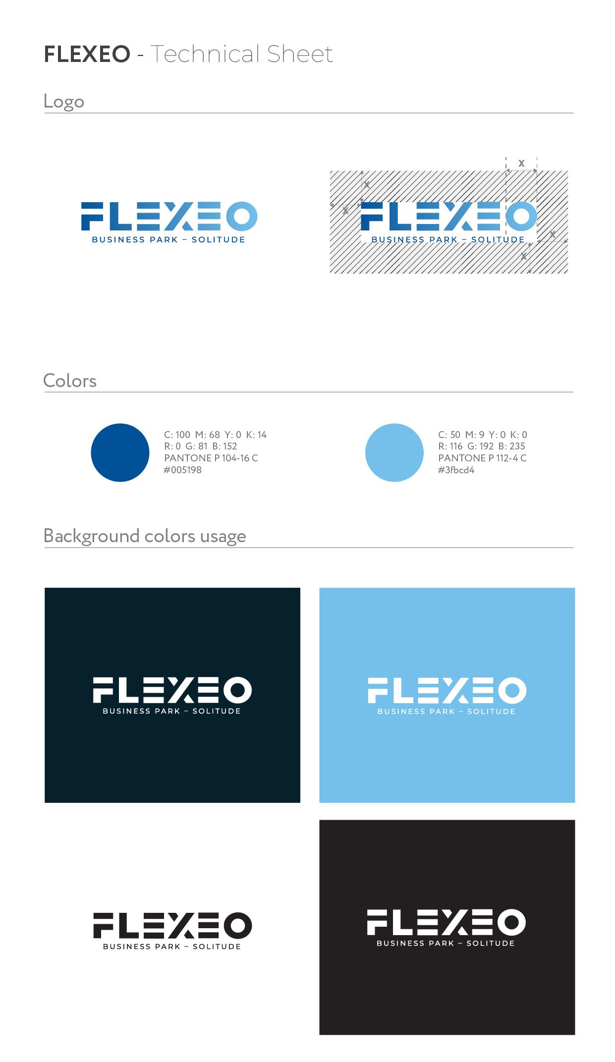
The brand identity design for Flexeo, a flexible storage solution based in Solitude Business Park, was a bit of a challenge. Being part of the housing stock of Evolis Properties Ltd, the logo needed to have an identity of its own while referencing the parent company. The logo uses a modular geometric letterform system — each character built from the same set of horizontal and vertical blocks — reflecting the core product: adaptable, stackable, structured space. The gradient shift from deep navy to light blue carries a sense of scale and openness, keeping the mark corporate enough for B2B credibility while avoiding the grey-suit stiffness that makes people forget your name. Storage is a spatial problem. The logo thinks in space too.
June 13, 2018